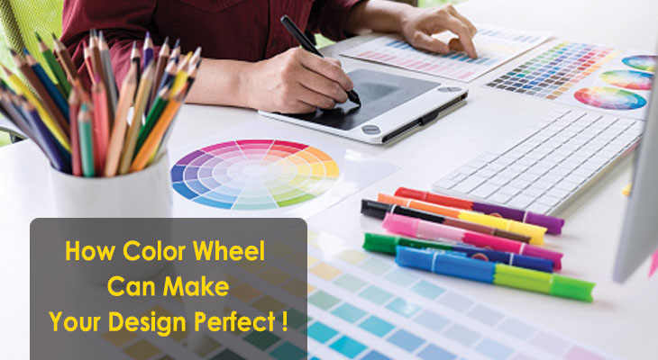
How Color Wheel Can Make Your Design Perfect?
Want to make your Graphics more eye catchy and perfect! Color Wheel can be your answer.
Undoubtedly, your attentions seek graphics, animated pictures and colorful images with content. Graphical contents, illustrated videos, colorful images and GIFs able to hold readers much time in your site. I assume, a few can reply that they are not artistic. They don’t have any idea on color wheel. So, I can now give you a brief synopsis about it.
Color is the important part of creating visual text. By using color theory user can easily make a perfect layout of the design. A vibrant color layout can get meaningful vision of your content. Actually color theory is a blend of science and technique of using color. It means how people can understand the color and in which can it be mixed properly to get a perfect contrast. Even color theory can convey the communication, feelings and mood of any situation.
According to color theory, colors are arranged and catalog into three part: primary color, secondary color and tertiary color. It is important to learn how colors work together and create mood in content. Color can create your own brand.
Different Types of Color!
Color wheel consists of total twelve colors. According to RGB color wheel system colors can be categorized into Primary Color, Secondary Color and Tertiary Color. RGB color wheel is important for the purpose of Digital platform like graphic design. Software such as Adobe Photoshop also use RGB color platform.
Though RYB or Red Yellow, Blue is mainly used for analogue purpose by painters.
Primary Colors – In the RGB color wheel, Red, Green and Blue are considered as primary colors. If these colors are mixed together they can create white light.
Secondary Colors- By mixing two primary colors you can get a secondary color. In the RGB color wheel cyan, magenta and yellow- these three colors are considered as secondary colors.
The three secondary color combinations are:
Red+ Green = Yellow
Green+ Blue = Cyan
Blue + Red = Magenta
Tertiary Colors – If you mix a secondary color with a primary color, you can get a tertiary color. According to RGB color wheel conception there are total six tertiary colors available. Spring green, azure, violet, orange, rosy pink and chartreuse green are the six colors observed to be in the tertiary color list.
The six tertiary color combinations are:
Yellow + Lime = Chartreuse Green
Cyan + Blue = Azure
Blue + Magenta = Violet
Red + Yellow = Orange
Magenta + Red = Rosy Pink
Lime + Cyan = Spring Green
CMYK MODEL- In this color model C stands for Cyan, M stands for Magenta, Y stands for Yellow and K stand for key. Here, Black is the ‘Key’ color. CMYK model is mainly used as a printer color model. Corel Draw, Illustrator software use CMYK color model.
Warm & Cool Colors– When we can draw a line in between of the color wheel and divide it equally into two parts we can visualize warm and cool colors here individually. Warm color denotes brightness and energy and it is included with red, orange and yellow.
Cool color refers to serenity and peace of mind. Cool colors means from green to blue and purple. Color psychology opined that, the balance of warm and cool colors depend on the different feelings of human mind. Warmth is associated with sun while coolness is associated with water.
Color Combinations- The two exact opposite colors in color wheel are called complementary color. There are totally six complementary colors in color wheel. By using complementary color your visual content showed with high contrast and more prominently.
Tetradic color refers to four colors those are equally distant from one another. Tetradic color scheme is valiant while it is merged with one ascent color.
The next combination is analogues color combination that refers to three colors in one side of a color wheel. This color combination is flexible and immense. To create an analogues color scheme choose a dominant color with an accents one. When you have lots of color combination in your palette, it is difficult for you to use it properly.
Though audience have different choice for color selection, the seven colors also convey different emotional inner meaning. The main object of color wheel is to build up a relationship between colors. This is an awesome tool for the designers.
Color conception is very important for Web Designing, Graphic Designing and also in Digital Painting. Saturation, luminance and hue scheme also provide your content intense brightness and purity. In digital painting you can learn the two innovative conceptions of tint and tones. Tint considered to be used white as a base color to get the image a light mood; similarly tones use grey or black color as a base color to bring the image in pastel shade.
If you can deeply understand the color theory and the impressive color schemes then you can create stunning Graphics. IMAGIC gives fresher students an opportunity to introduce themselves into the world of Graphics Designing by providing Professional Graphic Design Courses.
So, what are you thinking now? Join with us and make your life more colorful!
Written By – Dhrity Saha (IMAGIC DM Student)
